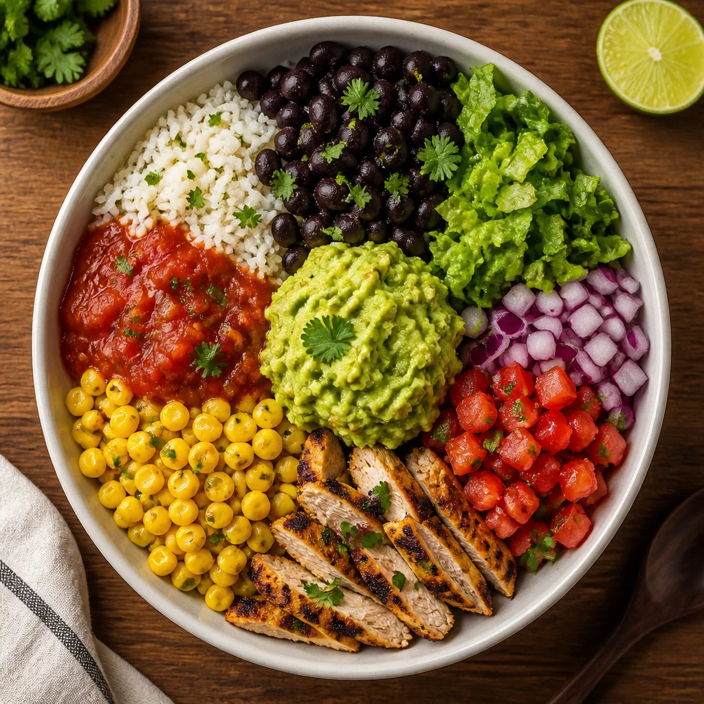
Visual appeal serves as the first taste of any meal. In a bowl-based format, the arrangement of colors and shapes signals the variety of nutrients and textures to follow. By strategically placing vibrant salsas against neutral grains and highlighting fresh greens, you create a roadmap for the palate. This guide explores how to transform a standard meal into a visually stunning and appetite-stimulating experience through deliberate layering and contrast.
Presentation relies on the contrast between the base and the accents. A visually appealing bowl utilizes negative space and distinct clusters of color to avoid looking like a homogenous mixture. This approach not only looks better but also allows for controlled bites where the diner can choose their flavor path.
The arrangement of ingredients in a bowl dictates the order in which we taste them. A central focal point, often the protein or a bright salsa, draws the eye and sets the tone. Surrounding this with contrasting colors—like deep green kale against golden corn—creates a sense of abundance and health. Structural layering is equally important. Placing dense, heavy grains at the base provides a stable foundation, while lighter, airy toppings like cilantro or crispy chips add height and movement.
"We eat first with our eyes. A bowl that lacks contrast often feels heavy and monotonous, even if the individual ingredients are high quality."
When selecting ingredients, visual consistency plays an important role. Below is our typical classification guide for this selection:
Specializes in textural profile tracking and balance methodology, documenting optimal combinations for modern casual dining environments.